Dom Młynarza - Branding
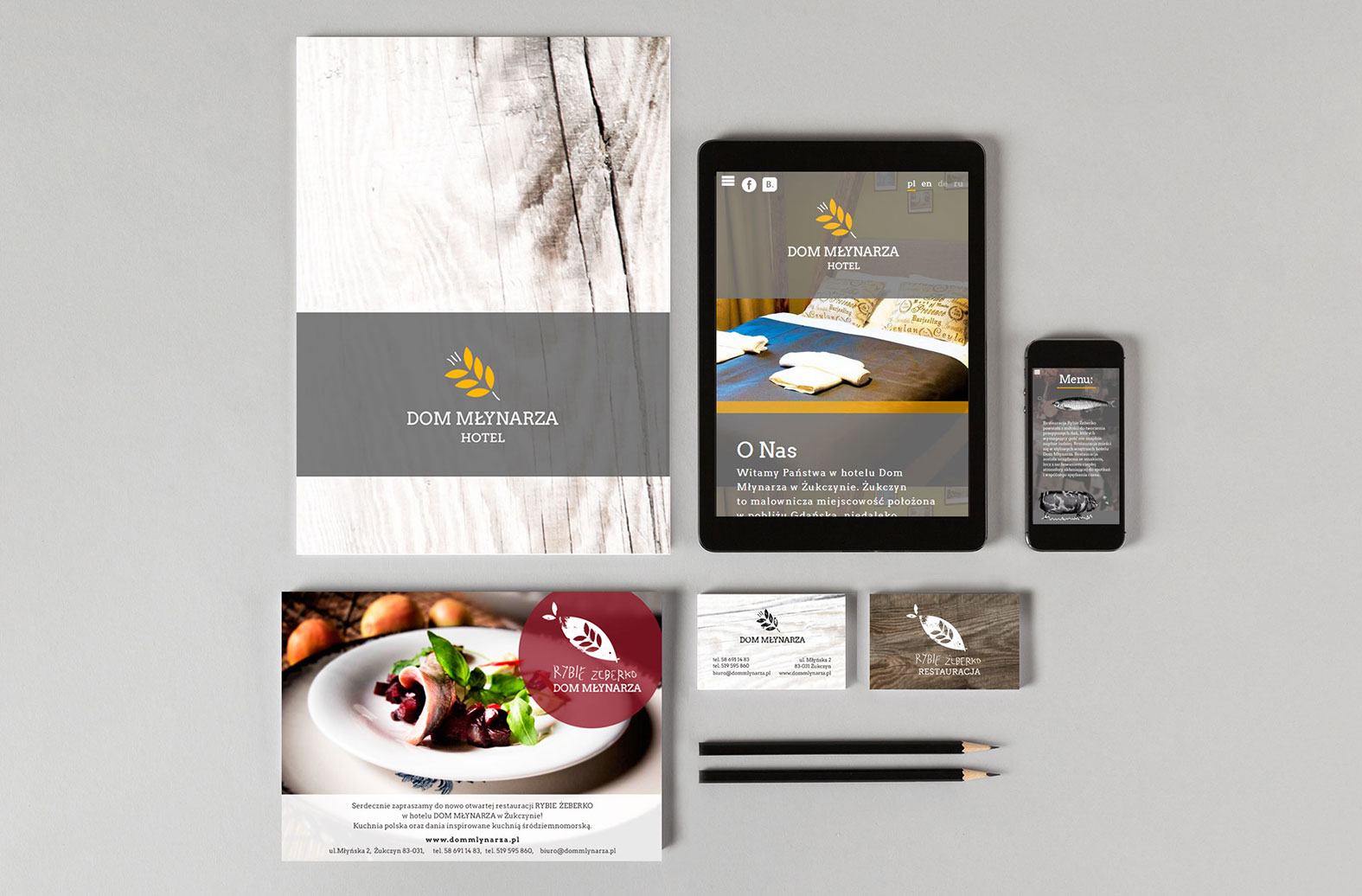
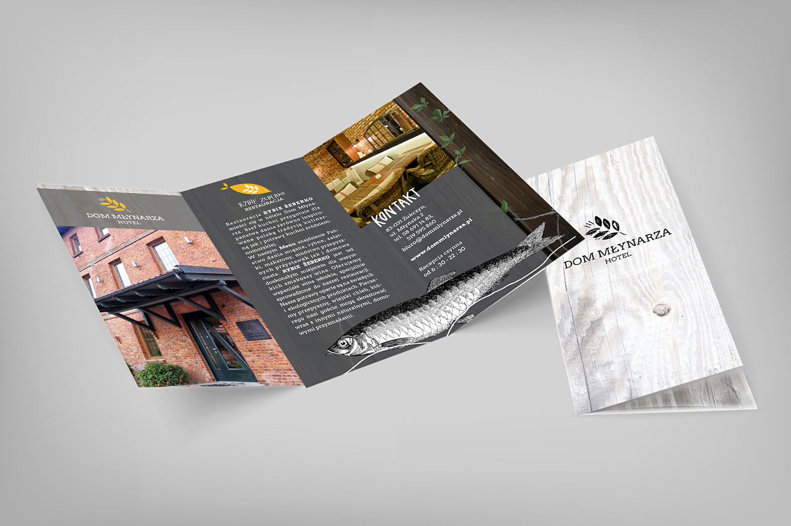
Branding for hotel Dom Młynarza and restaurant Rybie Żeberko in Żukczyn. Historical mill buildings of the hotel were used as inspiration to create a consistent image for all the design items.


- hotel logotype
- restaurant logotype
- website design
- flyer
- DL flyer
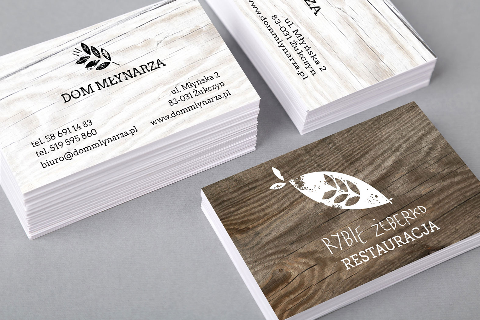
- business cards
- billboards
- newspaper ad
- food photography
- interior photography
- cardboard briefcase
In the logotype of the Hotel Dom Młynarza (it means Miller's House in polish) a cereal pictogram was created as a base for the design. That same pictogram was used in the Hotel's Restaurant Rybie Żeberko (it means fish spine). Despite being the same pictogram, in one logotype it looks like a cereal and on the other like a spine. Both logotypes establish individuality while representing the connectivity between both the Hotel and the Restaurant.